
Monday, June 2, 2008
Ublo

Here is the final logo that I designed for this assignment, I feel that it involves a quirky nature in the same way as other successful identities in the same field, for example F!NK design. I believe that its shape could easily be used on individual items in the range as well as shown below. In fact this logo is more designed as a product tag as that is how the large majority of consumers would identify it, the print and screen logo are basically just imitations of it used in this way.

Below is the full brochure. I kept the images large and used several pages because I wanted it to be something substantial that people would feel like looking at and maybe keeping around for a bit rather than just throwing it away instantly.


The website is image based as shown below, this is so that from any page a customer could look over the whole range of items.


Tuesday, May 6, 2008
assessment 2Thomas Hutchinson Assessment 2
Thomas Hutchinson Assessment 2
Response to the brief
I have interpreted the design brief for Assessment 2 as follows:
Rohan Nicol is an Industrial Designer requesting an identity for his product line. The main purpose of the identity is to represent him in attracting financial backing to tool and distribute the items. The Items are high end products, but mass producible. The identity needs to reflect this and represent him at all stages of contact with potential backers. Specifically Mr Nicol requires a Logo, The logo must be sophisticated and stylish while also being simple enough for translation across all stationary, screen and his metal items themselves. The designs should also reflect the modernist styling that Mr Nicol appreciates. He wishes to create the new identity either under his name or the name “ublo”. In addition to standard personal stationary, website and brochure, he requires a visual plan for the trade shows that he plans to attend, these will be major opportunities to find backing for the product line and it should be attention grabbing while supporting his identity.
The following are required upon the deadline:
3 logos and logotypes
A business card utilising the chosen logo
A Letterhead utilising the chosen logo
An advertising brochure in full colour to display and advertise his line
A 3 page mock website to support the above
A 3D mock-up rendering of the booth, including graphics and floor plan.
Design Audit
Of the following I have found that F!NK and Co has the most professional appearance and identity. I feel that the logo and colour choices represent the products perfectly and advertise the pieces as a worthwhile venture. Sean O’Connell’s identity was the most original and memorable but requires streamlining to make the orange dot more relevant to the products.
Based on the established brief and preliminary research, I feel that the name “ublo” is more suitable to represent this line as it creates an illusion of separation from other works and practises of Rohan Nicol. It is also more flexible in presentation and more memorable for potential backers and clients. The identity needs to by minimalist in that it should be a structure built to showcase the products rather than overshadow them. It is easy to see from Sean O’Connell’s identity how easy and simple it can be to unite all the elements of the identity with one simple and unremarkable icon.
Any text used should be rounded and crisp, as too should be the layout. The most successful identities used minimal colours, 2-3 bold colours seems to be the most practical solution and can be a visual connection to the colouring process used on aluminium.
Date 6/06/2008
Design audit, response to brief and preliminary research completed
13/06/2008
Logo’s created and picked. Fonts and colours chosen.
20/06/2008
Mock up site and stationary completed
27/06/2008
Stationary finalised. Mock up of trade booth shown for consultation.
6/06/2008
All elements finished & presented.
Estimate in Dollars (total for each stage) $180 $480 $800 $920 $1100

Noritake produces high class homewares.
Villa produces high class decorative homewares.
E-T make steel cook ware and table ware.


F!INK and Co was created in 1993 by Robert Foster, a graduate of the Canberra School of Art in Australia, which is the same place that Rohan Nicol Studied and then did Masters. Much of Robert Fosters work could be likened to Nicol’s, creating high end practical house hold pieces. There is also a consistent use of bold colours, rounded corners and similar material choices. The brand F!NK is successful in representing a number of designers work under one title. The name F!INK is interesting in that it is not an obvious representation of the designs or designers and could be likened to the ‘ublo’ title. The Logo is simple and bold but quirky enough to be recognisable.

Rohan Nicol is also partially represented by F!NK, having produced work under the name before such as the F!NK bracelet. Obviously this is a good reference point as to what Rohan is already comfortable with being represented by.

Oliver Smith is another Silversmith/designer who specialises in high end products, specifically table ware and has received the IDEA 07 ‘Product of the year award’. Oliver Smith represents himself under his full name again in a clear rounded font and repeats the tag line, “the best of craft and industry”.


Marc Pascal is a product designer specialising in high end home wares and lighting he represents himself with a signature logo which would be useful mainly for print and screen mediums. His identity uses a lot of white and displays no tag line and minimal clutter to showcase his designs in an elegant manner.

Workshop Bilk is a workshop and gallery that represents a number of Rohan Nicol’s peers. Bilk is another name similar to fink or ublo. And once again there are minimal colours used and the name is shown clearly and simply.

Sean Booth is a metal smith and peer of Rohan Nicol. Booth has created a bold logo from his initials but also has a tag line ‘SEAN BOOTH METAL STONE’ which is repeated through his website as a watermark type image.

Sean O’Connell is a similar silversmith who lacks conventional branding but is interesting in that his identity revolves around the orange dot featured as the navigation key in his website. His site is even called http://www.oneorangedot.com/ .

While I have not seen this in any other identities that I have looked at, it is very interesting and memorable. I might use something like this in my design.
Other unrelated pieces that I like and am inspired by:

Again the idea of symple symbols creating words and meaning in an original way. This type of quirky design is memorable and effective.

Another idea is to take past styles and attempt to reference them to make an almost novelty design.

This brand name is constantly crafted in metal and 3d forms and stands out well. The type flows well and does not look too staggered as with some other similar logos.
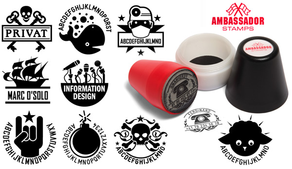
I also had an idea to emulate a stamp with the logo as it could easily transcend the mediums used

I just like the simplicity of the logo which yet conveys so much in the lettering and connotations of shapes.
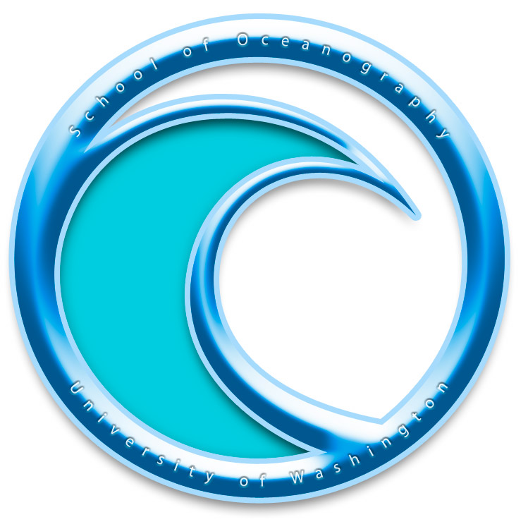
This logo appealed to me while I was looking for logos that I could imagine representing 3D wares. The bevel on the simple shape is a major factor in this.
Response to the brief
I have interpreted the design brief for Assessment 2 as follows:
Rohan Nicol is an Industrial Designer requesting an identity for his product line. The main purpose of the identity is to represent him in attracting financial backing to tool and distribute the items. The Items are high end products, but mass producible. The identity needs to reflect this and represent him at all stages of contact with potential backers. Specifically Mr Nicol requires a Logo, The logo must be sophisticated and stylish while also being simple enough for translation across all stationary, screen and his metal items themselves. The designs should also reflect the modernist styling that Mr Nicol appreciates. He wishes to create the new identity either under his name or the name “ublo”. In addition to standard personal stationary, website and brochure, he requires a visual plan for the trade shows that he plans to attend, these will be major opportunities to find backing for the product line and it should be attention grabbing while supporting his identity.
The following are required upon the deadline:
3 logos and logotypes
A business card utilising the chosen logo
A Letterhead utilising the chosen logo
An advertising brochure in full colour to display and advertise his line
A 3 page mock website to support the above
A 3D mock-up rendering of the booth, including graphics and floor plan.
Design Audit
Of the following I have found that F!NK and Co has the most professional appearance and identity. I feel that the logo and colour choices represent the products perfectly and advertise the pieces as a worthwhile venture. Sean O’Connell’s identity was the most original and memorable but requires streamlining to make the orange dot more relevant to the products.
Based on the established brief and preliminary research, I feel that the name “ublo” is more suitable to represent this line as it creates an illusion of separation from other works and practises of Rohan Nicol. It is also more flexible in presentation and more memorable for potential backers and clients. The identity needs to by minimalist in that it should be a structure built to showcase the products rather than overshadow them. It is easy to see from Sean O’Connell’s identity how easy and simple it can be to unite all the elements of the identity with one simple and unremarkable icon.
Any text used should be rounded and crisp, as too should be the layout. The most successful identities used minimal colours, 2-3 bold colours seems to be the most practical solution and can be a visual connection to the colouring process used on aluminium.
Date 6/06/2008
Design audit, response to brief and preliminary research completed
13/06/2008
Logo’s created and picked. Fonts and colours chosen.
20/06/2008
Mock up site and stationary completed
27/06/2008
Stationary finalised. Mock up of trade booth shown for consultation.
6/06/2008
All elements finished & presented.
Estimate in Dollars (total for each stage) $180 $480 $800 $920 $1100

Noritake produces high class homewares.
Villa produces high class decorative homewares.
E-T make steel cook ware and table ware.


F!INK and Co was created in 1993 by Robert Foster, a graduate of the Canberra School of Art in Australia, which is the same place that Rohan Nicol Studied and then did Masters. Much of Robert Fosters work could be likened to Nicol’s, creating high end practical house hold pieces. There is also a consistent use of bold colours, rounded corners and similar material choices. The brand F!NK is successful in representing a number of designers work under one title. The name F!INK is interesting in that it is not an obvious representation of the designs or designers and could be likened to the ‘ublo’ title. The Logo is simple and bold but quirky enough to be recognisable.

Rohan Nicol is also partially represented by F!NK, having produced work under the name before such as the F!NK bracelet. Obviously this is a good reference point as to what Rohan is already comfortable with being represented by.

Oliver Smith is another Silversmith/designer who specialises in high end products, specifically table ware and has received the IDEA 07 ‘Product of the year award’. Oliver Smith represents himself under his full name again in a clear rounded font and repeats the tag line, “the best of craft and industry”.


Marc Pascal is a product designer specialising in high end home wares and lighting he represents himself with a signature logo which would be useful mainly for print and screen mediums. His identity uses a lot of white and displays no tag line and minimal clutter to showcase his designs in an elegant manner.

Workshop Bilk is a workshop and gallery that represents a number of Rohan Nicol’s peers. Bilk is another name similar to fink or ublo. And once again there are minimal colours used and the name is shown clearly and simply.

Sean Booth is a metal smith and peer of Rohan Nicol. Booth has created a bold logo from his initials but also has a tag line ‘SEAN BOOTH METAL STONE’ which is repeated through his website as a watermark type image.

Sean O’Connell is a similar silversmith who lacks conventional branding but is interesting in that his identity revolves around the orange dot featured as the navigation key in his website. His site is even called http://www.oneorangedot.com/ .

While I have not seen this in any other identities that I have looked at, it is very interesting and memorable. I might use something like this in my design.
Other unrelated pieces that I like and am inspired by:

Again the idea of symple symbols creating words and meaning in an original way. This type of quirky design is memorable and effective.

Another idea is to take past styles and attempt to reference them to make an almost novelty design.
This brand name is constantly crafted in metal and 3d forms and stands out well. The type flows well and does not look too staggered as with some other similar logos.
I also had an idea to emulate a stamp with the logo as it could easily transcend the mediums used
I just like the simplicity of the logo which yet conveys so much in the lettering and connotations of shapes.
This logo appealed to me while I was looking for logos that I could imagine representing 3D wares. The bevel on the simple shape is a major factor in this.
Saturday, March 29, 2008
dolls

The doll logos are distinctly feminine. They generally use pink in the design. The fonts are often overly frilled and styled or at least use serifs. They are also often accompanied by a cutsie tag line eg. Loved to pieces, which goes hand in hand with the logo and business.
Tuesday, March 25, 2008
How do you write a design brief?
As a student, having received detailed and structured briefs from teachers and lecturers for several years it is an interesting concept to think of how this would actually work in the real world. Surely a contractual styled agreement that details the specific expectations of the business transaction from both the designer and the client would be a highly necessary thing.
So what is the best way to do this. The most desirable way would probably be to meet with the client where both parties could gain an understanding of how the transaction will unfold. After this it would be in the best interests of the designer to protect themselves and their understanding of the project by formalizing it in writing and submitting this with any further questions and perhaps a time line for progress and invoicing.
So what is the best way to do this. The most desirable way would probably be to meet with the client where both parties could gain an understanding of how the transaction will unfold. After this it would be in the best interests of the designer to protect themselves and their understanding of the project by formalizing it in writing and submitting this with any further questions and perhaps a time line for progress and invoicing.
Monday, March 24, 2008

Wednesday, March 19, 2008


Saturday, March 15, 2008
jewellry stores
These three logos are very different, This may be due to the size and market of each store. The Prouds logo reflects a chain of many stores all offering the same classy designs. The Logo has to give an impression of grandure and sophistication and also appear very trustworthy.
The verge logo reflects more of a boutique arrangement where the jewelery is more about refinements, individuality and finesse in craftsmanship.
The House of Jewellery is different again, it seems to be more of a store acting as a dealership for a wide variety of jewelery including cheaper peices
Wednesday, March 12, 2008
myer's opposition


The Myer Logo is different to these as it uses a black colour scheme in an attempt to comunicate class and therefore high quality in there products. Its competitors logos use a variety of colours to set themselves apart from the crowd. Big W's new 3d logo is part of a set of new logos available for download from their website. This new range is a noticeable update that aims to look more sophisticates, and modern. This is an example of a company updating its corporate image to reflect changes in its stores. Many Big W stores are currently going through major overhauls aimed to dramatically change the shoppers experience at the stores.
The Harris Scarfe Logo has gone several years without update and uses its distinctive logo, (if irregular and unpolished in comparison with other stores of its caliber) to retain a loyal client base.
Thursday, February 28, 2008
exercise 1
Response to readings 1.
This chapter, The Revenge of Brand X raised what I thought were some interesting points on the role of branding in todays consumer driven culture. It is easy to forget that it is in all simpleness a mark to set yourself apart from the masses. I found that the metaphor between branding a company and an animal useful in reflecting on company identities and the difference between those that succeed and fail. The ones that win a place in my mind are the simple and bold marks, marks of ownership. It also outlines what I think is an often misunderstood difference between advertising and the brand and the purpose of each, and while I believe that it is futile to have one without the other, they are both quite separate in that the brand is the loyalty that the consumer holds in their hearts and the advertising is the tool that attracts attention and changing intellectual stimulation
This chapter, The Revenge of Brand X raised what I thought were some interesting points on the role of branding in todays consumer driven culture. It is easy to forget that it is in all simpleness a mark to set yourself apart from the masses. I found that the metaphor between branding a company and an animal useful in reflecting on company identities and the difference between those that succeed and fail. The ones that win a place in my mind are the simple and bold marks, marks of ownership. It also outlines what I think is an often misunderstood difference between advertising and the brand and the purpose of each, and while I believe that it is futile to have one without the other, they are both quite separate in that the brand is the loyalty that the consumer holds in their hearts and the advertising is the tool that attracts attention and changing intellectual stimulation
Tuesday, February 26, 2008


Monday, February 25, 2008
ex1 b)

b) The Famous Stars and Straps logo.
This logo is for the Famous Stars and Straps clothing company. It is an interesting logo as it has strong affiliations with the music world. The owner Travis Barker has been the drummer for several prominent punk/pop/RnB/alternative bands and artists and has used his place in the music industry to raise the prominence of the brand and logo. The logo now enjoys the almost cult status of Atticus and Macbeth clothing, representing the wearer as more than just a t-shirt or belt buckle but a representation in the music subculture.
The aesthetic qualities of this logo include a prominent, stylised F within which a star is created with negative space. Unlike many modern logos, this one utilizes sharp corners and an intensional back slant which unbalances the image to create an impression of breaking away from the modern trends. The Logo is very bold aswell which can make it seem aggressive.
The Rusty Logo
This logo has ties to the surf and skate subculture. Its past clothing designs generally utilized darker tones and largely brown and grey colours with 'dirty' patterns or images.
The Rusty logo is successful do to its simple, minimal and jagged appearance. The image has an impression of movement and suspense.
circular logos

Simple shapes are useful in logo design as they can be easily recognizable and translate well to a wide range of sizes colours and mediums. Circles in particular are very smooth and none threatening and can appear very centred and bold.
Sunday, February 24, 2008
exercise 1

1) The Hutchinson Heraldic Crestis interesting in the use of two primary colours in solid blocks forming the background to a white design. This while very eyecatching makes it hard to concentrate on the design of the lion in the middle. The lion by today's reasoning should be facing the other way so as to create a forward facing message rather than facing backwards. The gold stars which are found on every variation of the crest are helpful in centering the lion.
The piece was obviously created to make a bold and aggressive statement about the family line, hence the blocks of colours and the lion as a centre point.
Tuesday, February 19, 2008
heraldic crests in logos


The use of the heraldic crest aesthetic is an interesting tool in that it gives an atmosphere of heritage, tradition, family and a tight-knit group. This gives the sense of something long established with pride in its self and as a force to be reckoned with.
The fact that the crest is a logo of sorts anyway means that it can easily be translated into the graphic design world.
Subscribe to:
Posts (Atom)